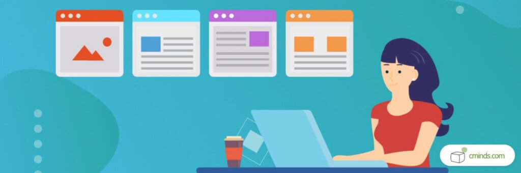
Tooltips are a useful tool for any website but there are some definite Do’s and Don’ts when it comes to their design.
Here’s what you should avoid.
What Are Tooltips?
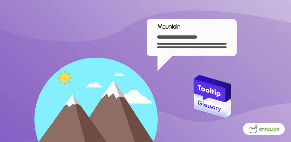
By definition, a tooltip is a graphical user interface (GUI) that appears when a user interacts with a webpage element. They’re most commonly activated through a mouse-over or keyboard-hover on a specific word.
The primary purpose of a tooltip is to display additional information without the need to click a button or navigate to a different page.
They are sometimes known under different monikers, including ScreenTips and help balloons – but tooltip is the most common name for this helpful feature.
Tooltips can be a valuable tool to have on any WordPress website. When used correctly, they can really help to improve user experience. However, like with anything, there are some pitfalls to avoid when it comes to their design.
In this blog, we’re taking a closer look at best practice when it comes to Tooltip design, to help you get the most out of this useful tool.
April 2026 Offer – For a Limited Time Only:
Get WordPress Tooltip Glossary Plugin for 15% off! Don’t miss out!
1. Don’t Overload with Too Much Text
Tooltips are a type of microcontent. They are meant to be short, concise, and to the point. The best tooltips define a term or explain an icon without taking over the content of your webpage.
Using paragraphs of text is never a good idea, as this will more than likely cover other important content on your page. If you include too much text, it becomes no longer a tip, but another page of content for the viewer to read. Your tooltip should not cover up any other text on the page.
2. Don’t Repeat Information
Tooltips are a way to define terms and show the purpose of icons, but they shouldn’t be repetitive. If you have a button on your webpage that says “Read more” then there is no need for a tooltip to say “Read more” on mouse-over. This is an unnecessary repetition that only creates clutter on your webpages.
Tooltips are designed to enhance your website content, not make it more confusing. Providing short and to the point information is key.
3. Don’t Place Multiple Tooltips Together
Sometimes there are multiple elements on a webpage that need to be defined by a tooltip, and these elements tend to be very close together. Avoid placing too many tooltips together as it will confuse the viewer and they won’t know which tooltip relates to which content.
Using a tooltip arrow is a simple way to show the viewer that the arrow is pointing to the tooltip they are currently hovering over. This avoids confusion and explains which tooltip is being viewed.
4. Don’t Use Tooltips Inconsistently
When it comes to tooltips, consistency is key.
Say you want to define the word tooltip. Then that word should be defined anytime it appears on any page or post on your website.
Tooltips are a good design element to have on your website. So they should be used everywhere, and have explanations where they are needed.
Tooltips should also be visible with a slight contrast when using text links. This way, the tooltip sticks out to the reader, but it is not upper noticeable or draws their eye away from the overall content.
Also, all of your tooltips should be available for mouse-over and keyboard hover. This way, users who can only access webpages with keyboards can still access and see your content.
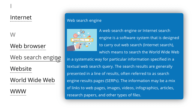
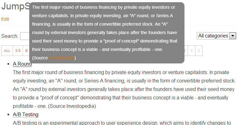
The Tooltip Glossary Plugin for WordPress
The Tooltip Glossary Plugin for WordPress is a powerful way to create tooltips and build a glossary of defined terms on your WordPress website. The glossary terms page is automatically generated to list all terms and is available to browse when users click-through via a tooltip.
One unique feature of this tooltip is that it is fully mobile responsive and usable with a touch screen. In addition, the tooltip works on hover over with a mouse and with keyboard strokes, making the plugin accessible to all.
Each tooltip also supports the use of synonyms, abbreviations, and spelling variations, and explains the flexibility of these words to users who click on them.
The index page created by the plugin comes with 18 different design templates, social media sharing buttons, a fast live search filter and an alphabetical navigation bar. Admin can customize the glossary to fit the look and feel of your website.
Users have the ability to submit terms to be added to your glossary page, with approval by an admin needed. All terms can be fully customized in color, font size, and more. Also, images, videos, and audio files can be added as tooltip content.
Conclusion
Tooltips are a useful visual tool that help the user navigate a website or learn new information about a topic or term. It’s important that tooltips blend into the look and feel of the website, without overpowering it.
There are ways to overuse tooltips so it’s important to avoid these. A tooltip is designed to be a short statement that provides help or defines terms. It should not be paragraphs of text or bigger than a pop-up advertisement.
Some key ideas to keep in mind with tooltips are to minimize text elements whenever possible, avoid repetition and overuse, and stay consistent.
Having icons cluttered together or give blocks of text popping up on a webpage destroys the flow of the page, looks awful, and can cause your viewer to leave the page or website altogether.

